
Hero Block | This is the hero heading for the Hero Block
This is the hero subheading. The image and links are no longer getting stripped out.
Section Heading (Optional)

The Featured Image Heading
This is the Featured Image Description. This is a plain text area allowing the Content Editor to add text in a paragraph. Line breaks are not expected/rendered. Large Padding, background color white, and button style secondary bold
Secondary Button Link Name (Bold)
The Featured Image Heading
This is the Featured Image Description. This is a plain text area allowing the Content Editor to add text in a paragraph. Line breaks are not expected/rendered. Gray background, Standard padding, Primary button
Primary Button Link Name (Bold)
Featured Image | Right
This is the description for the block. The image is set to appear on the right side (and does) but the rounded corners should be switched when the image is switched to the right side. Size is set to No Padding. When the standard, large, or extra large padding options are applied, the corners are rounded properly.
The Featured Image Heading
This is the Featured Image Description. This is a plain text area allowing the Content Editor to add text in a paragraph. Line breaks are not expected/rendered. No Padding, background color Gray and button style neutral outline
Neutral Button Link Name (Outline)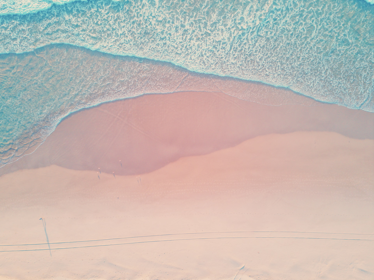
Full-Width Callout Heading
Full-Width Callout Subheading The image position is set to Top-Left. Content Position is set to Left, Text Alignment Left, Content Padding Large
Callout Button Name/TextThis is an Optional Heading before the Image block

This is an image that I found on Unsplash by Kalen Emsley. This is a rich text area that allows you to include a long description below the image.
This is the Headline for the CTA with Input
The background color is set to Light blue.
Featured Resources


Full-Width Callout Heading
Full-Width Callout Subheading The image position is set to Top-Left. Content Position is set to Left, Text Alignment Left, Content Padding Large
Callout Button Name/Text
Full-Width Callout Heading
Full-Width Callout Subheading The image position is set to Top-Left. Content Position is set to Center, Content Text Alignment is Right, Content Padding is Regular.
Callout Button Name/Text